Our review of FreshBooks
We liked the FreshBooks interface enormously, and it's very easy to use with lots of hints and tips to help you get started although there may be accessibility issues for some users. The software can sometimes be slow to load between pages, which is surprising because FreshBooks do operate at the higher end of the market in terms of pricing. You'll also need to pay additional fees if you want more users to have access to your account, which is something to think about if you're not the only person in your business.
FreshBooks does excel with lots of media content available to help you both with the software and with bookkeeping in general. That said, some users might find the lack of live chat support to be an issue these days.
Review breakdown
-
Ease of use
-
Speed
-
Features
-
Support
-
Price
-
User Experience
Summary
Overall Score
User Review
( votes)Software Features
Ease of Use
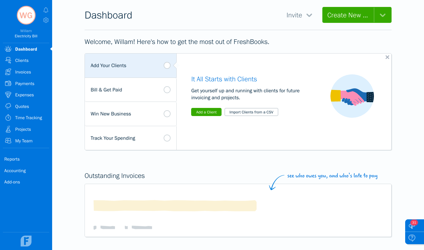
FreshBooks scores really well here, with a well-thought-out user interface making the software easy to navigate, and a pleasure to use. There are lots of pointers to help users get started too, though the ‘handwriting’ font of these descriptions might be visual issue for some users.
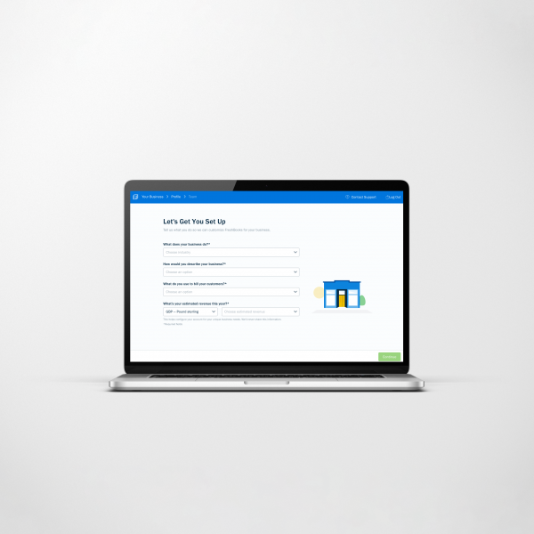
The welcome dashboard highlights some of the most commonly used features. Having confirmed during the account setup that this was an existing business, we’d expect to see a section here for entering Opening Balances, importing information and so on, although there is an option to import customers.
In general, FreshBooks do make it very easy to get started with the software, providing videos and links to what the user must do next. The lack of prompting to enter Opening Balances could potentially trip up inexperienced users transferring to FreshBooks (in fact the process for entering these when we did find it, isn’t that great either).
We did notice that, despite setting our country to ‘UK’, some of the vocab used in the software reminds us this is a Canadian software company, such ‘fiscal year’ instead of ‘financial year’.
Speed
The software can be slow to load between pages, and especially so on sign-in. Entering transactions manually can be a bit slow, too. Sadly, this is yet another software provider continuing to include bank reconciliation in their processes, despite bank feeds making this redundant.
Features
FreshBooks does well on the features front, especially when it comes to invoicing, links to Stripe, and customisation. The receipt uploads tool looks nice, but our favourite feature is Time Tracking. As well as manually adding in time spent, you can start a timer and then fill in the customer’s details to make the billing easier. Simple, but beautifully done and a cracking idea.
Support
Telephone, email and web content (including videos and webinars) are all available and included in the price. However, there’s no live chat support, which can be frustrating if you need help quickly but can’t really talk on the phone.
Price
Their cheapest package (£15 per month) throttles invoicing by restricting you to 5 clients, so most users will want one of the mid-price tiers, starting from £25 per month.
As you’d expect, the really good features are only available on the most expensive package, but this is quite pricey considering:
- What’s available from competitors with similar pricing
- What’s available from competitors at a much lower price
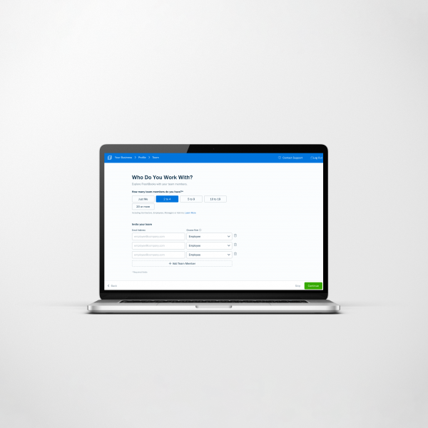
The big sticking point is how much it costs to add each subsequent user. You're looking at an additional £8 per user per month. Ouch!
What level of bookkeeping knowledge will I need?
A novice with little or no bookkeeping experience should be able to use this software, although anyone with more experience would probably want to use something more efficient.
Software Screenshots
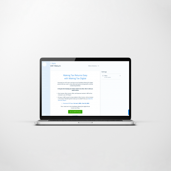
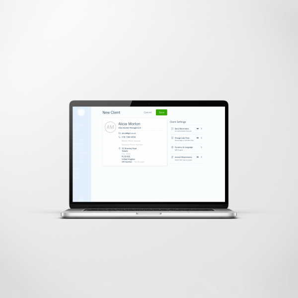
The software does look good, and all the ‘handwritten’ pointers do feel like you’re being shown round the place by someone who actually wants to help. The timer for billing clients is lovely. Their visual communication does a lot to explain things easily, too. For instance, the paperclip which shows you where to attach receipts to your expenses.
Entering banking transactions manually gets really tiresome once you get over how nice the design is, and working with nominal accounts was difficult.
